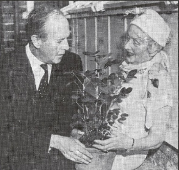
In 1959, when the world was casting about for peaceful applications of fission energy, activist Muriel Howorth established the Atomic Gardening Society, a global group of amateur gardeners who cultivated irradiated seeds, hoping for useful mutations. Howorth published a book, Atomic Gardening for the Layman, and crowdsourced her effort, distributing seeds to her members and collating their results. She herself made news with “the first atomic peanut,” a 2-foot-tall peanut plant that had sprouted from an irradiated nut.
She teamed up with Tennessee dentist C.J. Speas, who had a license for a cobalt-60 source and had built a cinderblock bunker in his backyard. Via Howorth he distributed millions of seeds to thousands of society members, but the odds remained against them: It would likely require many times this number to hit on a mutation that was potentially useful.
The Atomic Gardening Society disbanded within a few years, but it gave way to more ambitious “gamma gardens” of 5 acres and more in which plants are arranged in rings around a central radiation source. This technique continues today in America and Japan.


