The Lamppost Trick

https://commons.wikimedia.org/wiki/File:Norman_Rockwell_-_Boy_with_Baby_Carriage_-_Google_Art_Project.jpg

In 1916, when Norman Rockwell began his career painting covers for the Saturday Evening Post, he faced a “recurring crisis” in coming up with new ideas. “I’d feel all washed out, blank, nothing in my head but a low buzzing noise,” he wrote in his 1960 autobiography, My Adventures as an Illustrator. “One day, after I’d been aimlessly sketching and crumpling up sheets of paper for hours, I said to myself, This has got to stop; I can’t sit here and muse all day. So I figured out a system and used it for 20 years or so.”

When I had run out of ideas, I’d eat a light meal, sharpen 20 pencils, and lay out a dozen pads of paper on the dining room table. Then I’d draw a lamppost (after a while I got to be the best lamppost artist in America). Then I’d draw a drunken sailor leaning on the lamppost. I’d think about the sailor. Did his girl marry someone else while he was at sea? He’s stranded in a foreign port without money? No. I’d think of the sailor patching his clothes on shipboard. That would remind me of a mother darning her little boy’s pants. Well, what did she find in the pocket? A top. A knife handle. A turtle — I’d sketch a turtle slouching slowly along to —

He would spend three or four hours following this random train of thought while drawings piled up on the floor; then he’d go to bed miserable and desperate. The next morning, still desperate, “I’d kick my trash bucket and suddenly, as it rolled bumpety-bump across the floor, an idea would come to me like a flash of lightning.” He’d follow up this new idea, and once he understood enough about the scene, he removed the lamppost.

“I’d given my brain such a beating the night before that it was in a sensitive state,” he explained. “Pretty soon I’d have a Post cover.”

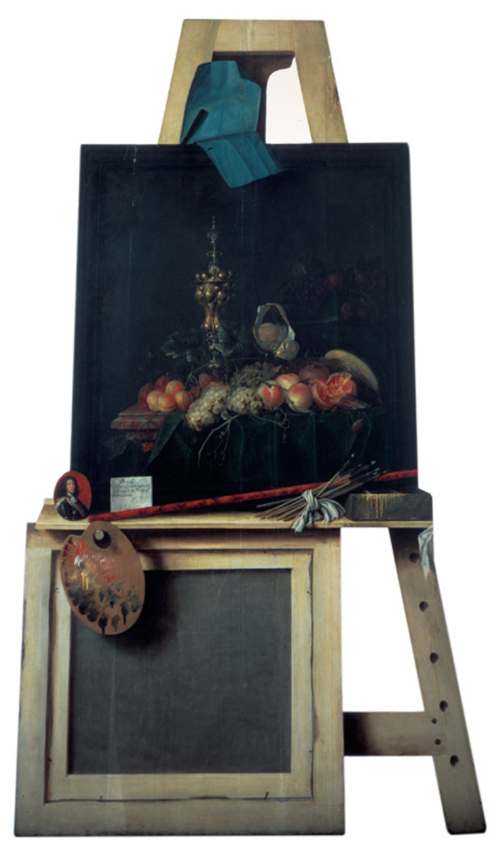
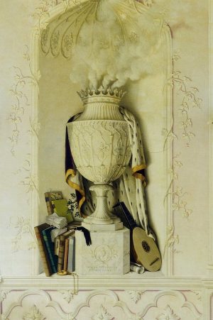
Trompe-L’œil

https://commons.wikimedia.org/wiki/File:Interior_of_Jesuit_Church,_Vienna_(1).jpg
Image: Wikimedia Commons

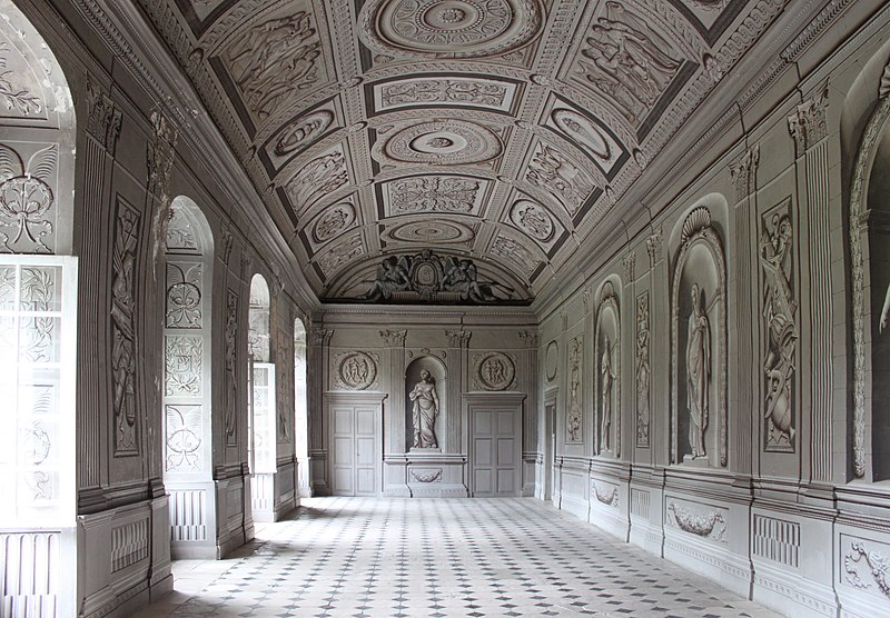
The dome in Vienna’s Jesuit Church isn’t there — artist Andrea Pozzo painted the ceiling of the nave in 1703 to create a convincing illusion when viewed from the right angle.

A stone slab in the floor indicates the ideal spot from which to view it.

DIY

Financial publisher Gilbert Kaplan fell so in love with Mahler’s second symphony that he bought the manuscript, paid musicians to teach him to conduct it, rented Avery Fisher Hall, and led the American Symphony and the Westminster Symphonic Choir through a performance of his own in 1982.

The orchestra had requested that no reviews be published, but the Village Voice published one anyway — and it was favorable. So Kaplan conducted the symphony another 100 times throughout his life and recorded it twice, with the London Symphony Orchestra and the Vienna Philharmonic. Opinions were mixed, but he did receive some discerning praise. Of a 2008 performance with the New York Philharmonic, Steve Smith wrote in the New York Times:

That Mr. Kaplan is no professional conductor was immediately apparent. Square-shouldered and stiff, he indulged in no flamboyant gymnastics. He conducted from memory, beating time proficiently and providing cues as needed. Only in a few passages, like the pages of heavenly bliss just before the first movement’s tempo-sostenuto conclusion, did a curl of the lip suggest that he was swept up in his work. His efforts were evident throughout a performance of sharp definition and shattering power. From the acute punch of the opening notes, every detail of this huge, complex score came through with unusual clarity and impeccable balance. Every gesture had purpose and impact, and the performance as a whole had an inexorable sweep. … It seems likely that no one is better equipped to reveal the impact of precisely what Mahler put on the page.

But trombonist David Finlayson called the same performance a “woefully sad farce,” and Kaplan wasn’t asked back. “I don’t think anyone will confuse me with Lorin Maazel when it comes to technique,” he said, “and I may need to speak more than somebody who is more skillful, like Lorin, but I do get the results I want, and I did get the results I wanted that night. If some people are displeased, I can’t help it.”

Memorial

https://commons.wikimedia.org/wiki/File:Wien_-_Holocaust-Mahnmal_(2).JPG
Image: Wikimedia Commons

In Vienna’s Judenplatz stands a construction of steel and concrete that takes the shape of a library turned inside out. Its walls are filled with books, but the spines are all turned inward, so the knowledge they contain is inaccessible. It bears two large doors, but these do not open.

It is a memorial to the Austrian victims of the Holocaust. Artist Rachel Whiteread said, “It was clear to me from the outset that my proposal had to be simple, monumental, poetic and non-literal. I am a sculptor: not a person of words but of images and forms.”

At the unveiling, Simon Wiesenthal said, “This monument shouldn’t be beautiful. It must hurt.”

Imagination

In particular it is what might be called ‘comparative originality’ that is so awful. If a man were to look over the fence on one side of his garden and observe that the neighbor on his left had laid his garden path round a central lawn; and were to look over the fence on the other side of his garden and observe that the neighbor on his right had laid his path down the middle of the lawn, and were then to lay his own garden path diagonally from one corner to the other, that man’s soul would be lost. Originality is only to be praised when not prefaced by the look to right and left.

— Quentin Crisp, “The Genius of Mervyn Peake,” 1946

Reversals

https://commons.wikimedia.org/wiki/File:Mozart_Trio_from_Wind_Serenade_K388.png

The trio section of Mozart’s Serenade for Wind Octet in C, K. 388 (audible here at 14:30), is a double mirror canon: The second oboe introduces a line and after two bars the first oboe joins it playing the same line “upside down”; then the first bassoon starts its own line and the second bassoon enters playing that upside down. Now all four parts are exploring the same theme, but they’re offset by two bars apiece and two of them are inverted.

Pianist Erik Smith called this “the visual image of two swans reflected in the still water,” “a perfect example of Mozart’s use of academic means, canon, inverted canon and mirror canon, to a purely musical and emotional end.”

A Missed Train

https://commons.wikimedia.org/wiki/File:William_Powell_Frith_The_Railway_Station.jpg

Is this art? It’s The Railway Station, painted by William Powell Frith in 1862. In his 1914 book Art, critic Clive Bell singled out Frith’s painting to claim that it wasn’t art at all. Why? Bell said it lacks “significant form,” which he defined as “lines and colours combined in a particular way, certain forms, and relations of forms, that stir our aesthetic emotions.” Frith’s painting, he said, provoked pleasant feelings in him but no aesthetic emotion:

Few pictures are better known or liked than Frith’s Paddington Station: certainly I should be the last to grudge it its popularity. Many a weary forty minutes have I whiled away disentangling its fascinating incidents and forging for each an imaginary past and an improbable future. But certain though it is that Frith’s masterpiece, or engravings of it, have provided thousands with half-hours of curious and fanciful pleasure, it is not less certain that no one has experienced before it one half-second of aesthetic rapture — and this although the picture contains several pretty passages of color, and is by no means badly painted. Paddington Station is not a work of art; it is an interesting and amusing document in which line and color are used to recount anecdotes, suggest ideas and indicate the manners and customs of an age: they are not used to provoke aesthetic emotion.

Was he right? Notably, in a 2012 survey of 105 art professionals, not one agreed with him: 97% of the respondents said they felt Frith’s painting was art, and the remaining 3% were unsure.

“Admittedly, these data do not prove that Bell’s theory is wrong,” the authors note. “The sensibilities required to detect significant form and experience the aesthetic emotion it provokes could be even rarer than Bell claimed.”

(Richard Kamber and Taylor Enoch, “Why Is That Art?”, in Florian Cova and Sébastien Réhault, Advances in Experimental Philosophy of Aesthetics, 2019.)

Precocious

https://commons.wikimedia.org/wiki/File:Martinu_1897ca.jpg
Image: Wikimedia Commons

Composer Bohuslav Martinu had a remarkably inauspicious start in life: He was born in a church tower in Bohemia, which the town had granted to his father, a sexton. A sickly child, he often had to be carried up the 143 stairs on his father’s back. He was shy, reticent, and physically uncoordinated. “It would be hard to imagine a more unpromising environment for a child composer, for there was no significant musical tradition within the family and for several years he hardly ever ventured from the tower,” writes Barry Cooper in Child Composers and Their Works.

He excelled in violin, but since manuscript paper wasn’t available to him it’s not clear how many of his early compositions have been lost. When he ventured to the Prague Conservatory in 1906, he offered a three-movement string quartet that he’d written at age 10. He hadn’t even learned the alto clef, and used the treble clef instead for the viola part.

His mother said that the director “was so impressed by Bohus’ composition that at first he doubted whether the score was my son’s own work, and asked who had helped him.” But no one in his village would have been skillful enough to do so.

They accepted him, and he went on to a distinguished international career, writing six symphonies, 15 operas, 14 ballet scores, and a wide range of orchestral, chamber, vocal, and instrumental works.

Self-Portrait

The Hurwitz Singularity, an anamorphic sculpture by artist Jonty Hurwitz, began with a scan of the artist’s own head.

“I wanted to capture my physical being in as much detail as technology allowed,” he writes. “It felt appropriate to be able to analyse myself at the highest resolution that modern science could record spacetime.”

“This sculpture evolved when I was deep in Freudian Therapy. Four days a week on the sofa blazing new trails from the road that Sigmund Freud first mapped. To my analyst I dedicate this piece. Dr Sanchez Bernal this is the Hurwitz Singularity!”

There’s more at the artist’s website.

Presence

https://commons.wikimedia.org/wiki/File:Antony_Gormley_Quantum_Cloud_2000.jpg

Anthony Gormley’s 1999 sculpture Quantum Cloud is well named — it both does and doesn’t present the figure of a man. It’s composed of sections of steel 1.5 meters long, arranged by a computer using a random walk algorithm starting from points on the surface of an enlarged version of the sculptor’s own body. The result manages to suggest a man’s image without quite depicting it.

“How can you convey the fact that the presence of somebody is greater or different from their appearance?” Gormley writes. “The DOMAINS allowed me to evoke the internal space of the body as a field, but are still bound by an invisible skin: I want to extend or ignore the skin.”

It stands now next to the O2 in London.